Bad enough, that we have to read und hear current failures of thought by right wing populists (article in German only) and many relativizations (comments in German only). It seems like 70 years of History class did not help to stop utter racism in public debate.
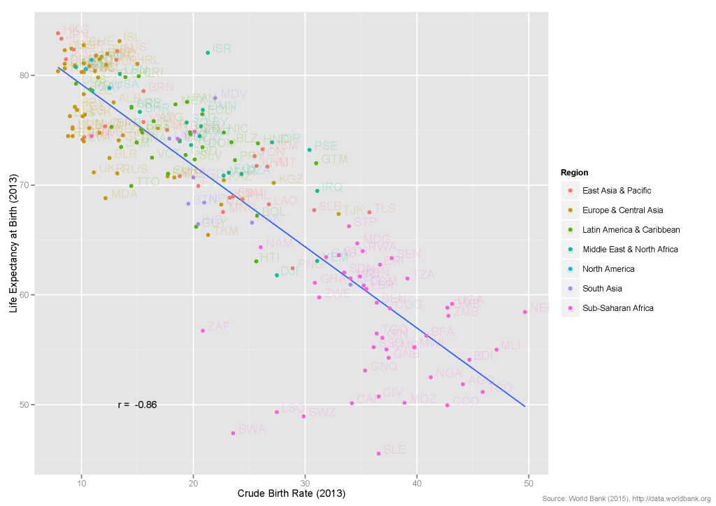
What, however, sparked my interest was the question what correlations with birth rates there are. My intuitive expectation was, that higher life expectancy is linked to lower birth rates, what might also be explained from an evolutionary perspective.
Now, I’m neither an anthropologist nor do I know the current state of research and I can only use openly available statistics. Luckily, the World Bank has a large database with various indicators for all countries and regions of the world.
Setting up an R script for reading the data was easy. I was able to quickly check my hypothesis visually and 
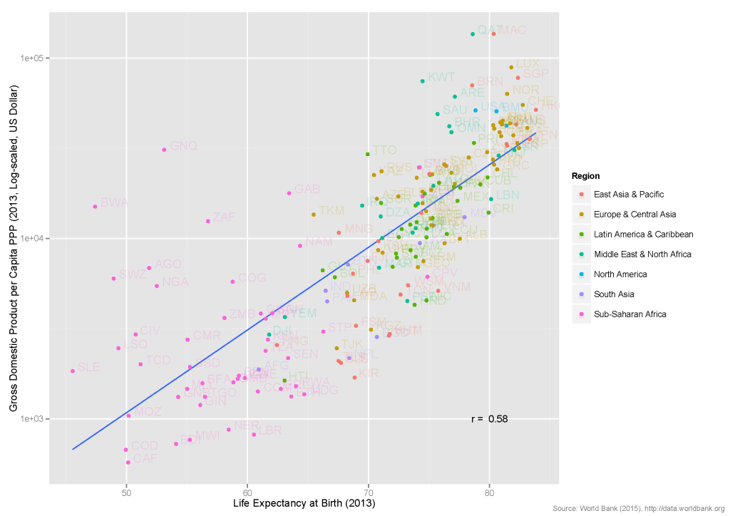
However, it is known, that Life Expectancy is also closely linked to standard of life or a country’s Gross Domestic Product (GDP). If you plot Life Expectancy against GDP, you find a correlation of 
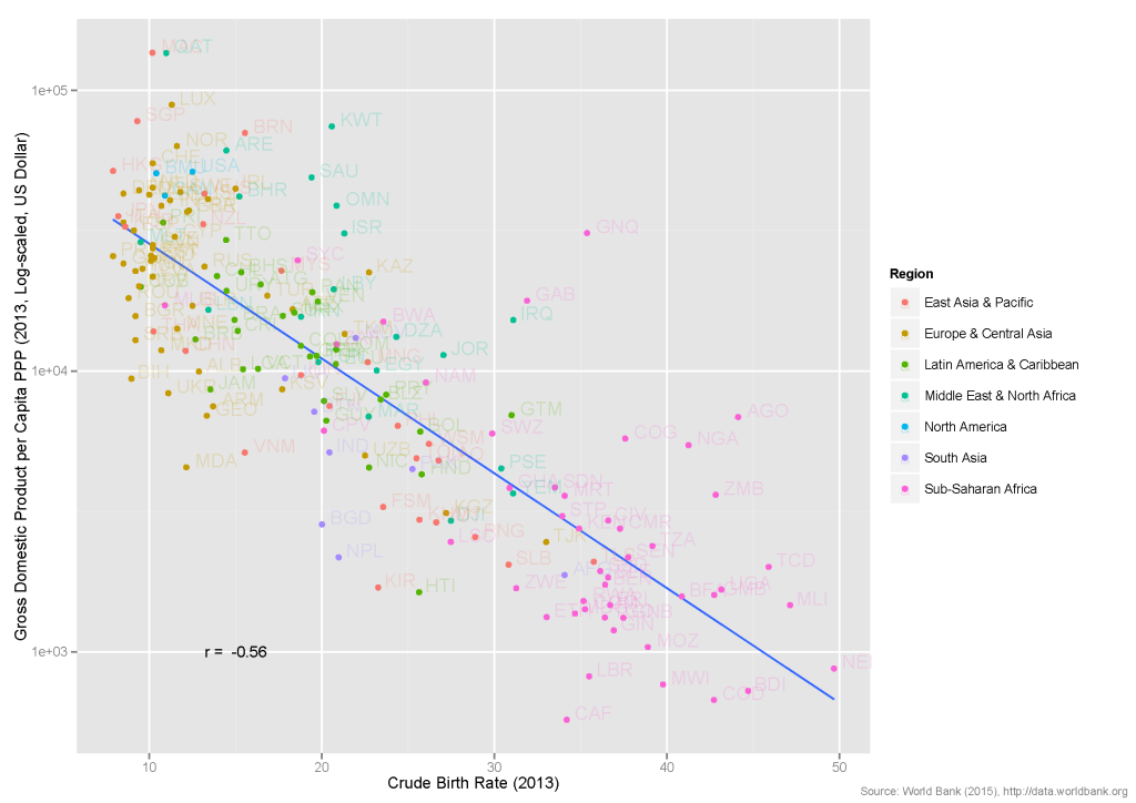
The same is true for Birth Rates and Gross Domestic Product with 
This is the classical situation why high correlations per se do not indicate a causal effect: additional variables can explain a statistical correlation. A very common example is the correlation between shoe size and vocabulary, that is “created” only through the strong effect of age on both shoe size and vocabulary — controlling for age, the link disappears.
Thus, the interesting question is how the partial correlation between Life Expectancy and Birth Rates looks if we control for a country’s GDP:2
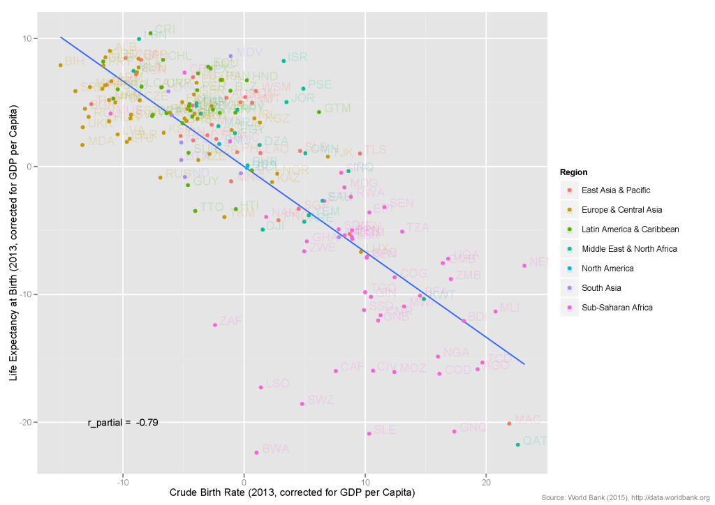
Interestingly, you still find a substantial correlation of 
Of course, this is not ultimate evidence for the hypothesis that Life Expectancy effects Birth Rates (see above), but it’s interesting to see that the link still holds.
In my interpretation the graphs show that other effects are at work than some “reproduction types”, which originate in a completely different context. Using those terms only shows the true nature of such statements: fan fear and stir up hate using a pseudo-scientific language.
Update (04.01.2016): I have uploaded the R script for generating the plots on GitHub. You find it here.
- Life Expectancy at Birth and Crude per Birth Rate, i.e. births per 1,000 of a population for 2013 were chosen as it was most complete data set available. Countries with missing data were excluded from the analyses. ↩
- Partial correlations are calculated on the basis of residuals from a linear regression, leading to the values on the axes. Thus, strictly speaking, the labels of the axes is not correct. ↩
Leave a Reply