In my university course on Psychological Assessment, I recently explained the different quality criteria of a test used for dichotomous decisions (yes/no, positive/negative, healthy/sick, …). A quite popular example in textbooks is the case of cancer screenings, where an untrained reader might be surprised by the low predictive value of a test. I created a small Shiny app to visualize different scenarios of this example. Read on for an explanation or go directly to the app here.
Imagine, for example, a disease that affects 1% of a population and you have a blood test for the disease. Your test has a 90% chance to correctly identify someone who carries the disease (Sensitivity = 0.90) and a 95% chance to correctly identify someone who does not carry the disease (Specificity = 95%). Now you use your blood test as a screening test on the general population. Now, take a random patient who you have tested and the test has yielded a positive result (e.g. the blood level of a particular enzyme is higher than a pre-defined cut-off value). The interesting question now: What is the probability of the patient to actually carry the disease, given his positive test result?
Most of the time, people without statistical training will give an answer somewhere along the lines of 90% or 95% based on the values of Sensitivity and Specificity. But probability theory is somewhat more complicated: While Sensitivity and Specificity represent a conditional probability given the actual health state of the patient, the above question is about the conditional probability of being healthy or sick given the test result. That means, we are not looking for the probability of identifying someone given his health status (that we do not know), but we are looking for the probability of actually having the disease when the tests tells us the patient has it. Those two probabilities sound very similar, but can be, in fact, very different from each other. The relationship between those conditional probabilities is described through a formula called Bayes’ Theorem:
 = \frac{P(B|A) P(A)}{P(B)}")
What we are looking for is called positive predictive value (PPV), the probability of having the disease given a positive test result.
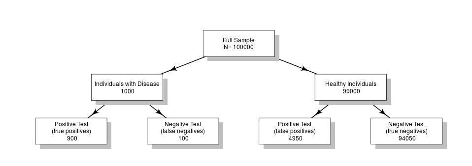
In fact, for the above example, the positive predictive value is only 8.33%. The reason lies in the low prevalence of the disease (only 1%): Out of 100,000 people 900 of 1000 would have correctly been tested positive, but far more (4,950 of 99,000 healthy individuals) have a positive test result despite being healthy.
On the other hand, with a probability of 99.89% you do not have the disease if you have a negative test result (the negative predictive value).
To show that the prevalence is important for the predictive value, imagine that the disease would affect 80% of the population: In this case, the same test would have a positive predictive value of 97.30%. This could be, for example, the case if you only use the screening test on people who have specific symptoms of the disease.
To better visualize the relationship between Prevalence, Sensitivity, Specificity and the predictive values, I created a small Shiny app where you can play around with different scenarios: https://neurotroph.shinyapps.io/Sensitivity-Specificity/
What follows, is often a discussion on the implications and consequences. Many real-world screening tests have lower Sensitivity and Specificity than above values, but are still being used for screening and testing purposes. When discussing the usefulness of such screening instruments, you have to consider different aspects such as: who do you test (everyone or only a sub-population carrying certain risk-factors), what are the costs of false negatives versus false positives and what follows a positive test result (operation, further diagnostics, etc.)? There is no universal answer to the question and it is not only related to the statistical aspects, but also to ethical considerations. But in any case, it is important – also for patients receiving test results from their doctors – to understand that a test result always has underlying probabilities and in some cases it is more probable to have a false positive than to actually be sick.
Update (28.10.2016): Felix Schönbrodt has another and better way to visualize the counts and probabilities from scenario described above. Check out his Shiny app here.
Leave a Reply