My last blog post was on the difference between Sensitivity, Specificity and the Positive Predictive Value. While showing that a positive test result can represent a low probability of actually having a trait or a disease, this example used the values of Sensitivity and Specificity as pre-known input. For established tests and measures they indeed are often available in literature together with recommended cut-off values.1
In this post, I would like to show how the choice of a cut-off value influences quality criteria such as Sensitivity, Specificity and the like. If you just want a tool to play with, see my Shiny web application here.
Imagine, you have a psychometrically developed questionnaire to ask for some behavior and you would like to use it as a screening test for Depression. To validate your test, you have tested 5,000 people from a specific population (e.g. University students) and you know from a longitudinal study that 1.5% of of the population has a Depression (prevalence).
Let’s now assume that your test scores are approximately normally distributed and that variance is identical in both healthy and sick individuals. From your data on the 5,000 students you estimate the population variance to be 81 (i.e. population standard deviation $\sigma = 9$).
Further, you found out that healthy individuals have a test score of 10 on average (


So, now you have a sample of 5,000 University students of which 4,925 are healthy and 75 clearly have a depression. Your healthy students have a mean score of 10 with a standard deviation of 9 and your depressed students have a mean score of 46 also with a standard deviation of 10.
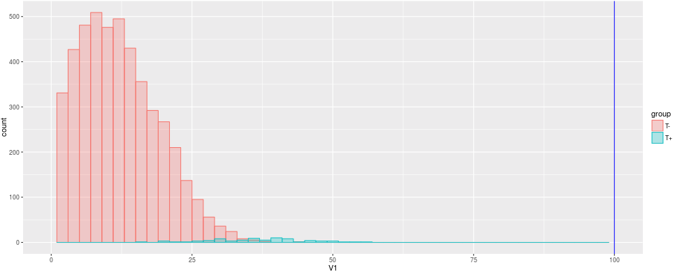
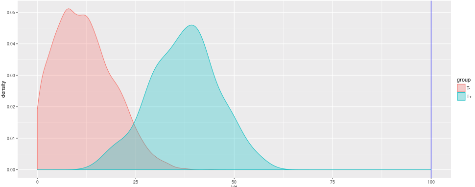
Since there are so many more healthy students than sick students, the depressed are barely visible in the histogram. The density plot helps us to see the distribution independent from the prevalence.
The question of interest now: How to choose a reasonable cut-off value in your test, that efficiently differentiates between healthy and depressed students?
As a first guess we might choose 50 as cut-off value as it is exactly the half of our possible test scores between 0 and 100. In this case, we would only identify 7 sick individuals as sick, but we would have no false positives, though.
Cut-Off-Value = 50
Error Type 1 (alpha): 0 %
Error Type 2 (beta): 1.36 %
Sensitivity: 0.093
Specificity: 1
Okay, not good enough, let’s choose 
Cut-Off-Value = 23
Error Type 1 (alpha): 8.56 %
Error Type 2 (beta): 0.16 %
Sensitivity: 0.893
Specificity: 0.913
Our measures have improved notably: We make only 0.16% false negatives and 8.56% false positives. Our positive predictive value is at 0.135. So well so good. But can we do even better?
Let’s move our Cut-Off-Value further up. Let’s say, 28, which is one standard deviation below the mean of the depressed students:
Cut-Off-Value = 23
Error Type 1 (alpha): 2.34 %
Error Type 2 (beta): 0.3 %
Sensitivity: 0.8
Specificity: 0.976
Well, now we have much less false positives, while having a bit more false negatives. Our Specificity increased while our Sensitivity decreased to 0.8. Our positive predictive value, i.e. the probability of being sick when having a positive test result, is at 0.339.
Can we improve even more? As we have seen in just the three examples above, any change to the cut-off value will move Sensitivity and Specificity in different directions. The same with both error types. So, sooner or later we have to include some considerations of costs: What is more costly to us/the patient/the society/…: False positives or false negatives?
While you can try to find an optimal solution based on statistics, in real world applications some error might have more costly implications (e.g. false positives leading to a therapy that might be very expensive or has strong side effects, so you would not want to experience an actually healthy patient with it) than the other. So, you might end up with a solution different from an optimal solution based on statistics alone.
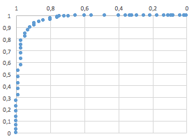
A systematical approach to find an optimal statistical solution uses Receiver Operating Characteristics-curves (ROC curve).
While the example above is created out of the blue, the real world might have some pitfalls. First, we assumed a normal distribution with equal variances in both healthy and sick sub-populations. In the real world, skewed distributions or very different variances might occur. If further, the difference between healthy and sick is small, your test has a low reliability and/or a very low prevalence, it will be difficult to obtain high Sensitivity and Specificity. The example and the web app below should show you the different relationships between disease characteristics, test characteristics and quality criteria. Finding the right cut-off can be difficult and “optimal solution” does not always mean a perfect test.
If you want to play around with different values and different scenarios, you can try out this web application by yours truly: https://neurotroph.shinyapps.io/Shiny-CutOffs/
Since a random sample is drawn each time an input aside the cut off value is changed, different values than above might occur. These differences are just due to sampling error, but the magnitude of the values should not change significantly.
- That is the value that differentiates “healthy” from “sick”: Usually this means, if you have a value higher than X you have a positive test result. Most commonly, this is some kind of translation of a metric value (as a test score) into a dichotomous decision. ↩
Leave a Reply